Machine Learning Classification Part 1: Creating Models
Classification is a type of supervised machine learning where you assign (classify) a value/observation in a data set to a specific category or class. Classification models are used for:
- Answering question like: will a person purchase a product or not?
- To read numbers from digital pictures for mail sorting or OCR.
- To determine if a person suffers from a specific type of disease and whether a particular treatment might be effective.
It is sometimes described as "putting things in buckets."
Classification is different from its closely related sibling, regression. Regression algorithms are used for predicting continuous observations.
Classification uses a training set containing data that has been "labeled" by a person or process to generate a mathematical model for predicting the labels/categories of data that it has not seen yet. This article looks at how you can create a classification model using Python using Pandas and SciKit Learn. In Part 2 of this article, we will look at how you can assess and tune a classification model to improve its accuracy.
If this is your first exposure to machine learning, take a look at Models of Machine Learning. It will provide an overview of what Machine Learning is, the various flavors and types, background on preparing data, and examples of how machine learning can be applied.
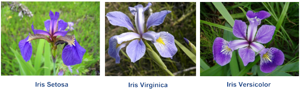
Iris Species
In this article, we will guide you through the process of creating a classification model for determining what species of Iris a set of observations belong to. The data we will be using contains information about three species of Iris: Setosa, Virginica, and Versicolor.
The Iris flower data set was first collected by the British statistician and biologist Ronald Fisher in 1936. It is an important (and somewhat controversial) data collection that is broadly used for teaching machine learning and statistics. It's commonly used as a test-case for classification models such as support vector machines and decision trees, as well as a for assessing clustering algorithms (a type of unsupervised machine learning).
The Iris Data Set
For this project, we will be using a copy of the Iris Data Set from the UCI Machine Learning repository. The data set includes four features: the length and width of the iris sepals and petals (all values are measured in centimeters). Fifty samples of each of the three species (150 total observations) are available. The species of iris is the fifth column of the data set.

Creating the Model
To create the model, we will be using the Python programming language and core libraries of the Scientifiy Python Stack. These include Pandas, SciKit-Learn, Matplotlib, and Seaborn.
- Pandas will be used for data preparation and cleaning.
- SciKit-Learn will be used to create and assess the models.
- Matplotlib and Seaborn will be used for data visualization.
Of the libraries we use in this article, SciKit-Learn provides the lion's share of the functionality. Scikit-Learn, one of the the most popular machine learning libraries in the Python ecosystem, is used to create and deploy supervised and unsupervised machine learning models. In many ways, it is what brought machine learning to the masses.
It implements dozens of machine learning algorithms covering classification, regression, clustering, and dimensionality reduction. It provides libraries for evaluating model choice, selecting an algorithm, and tuning model performance. It includes data processing tools that can help with extracting features and building data pipelines. Most importantly, it provides documentation showing the code's usage and exposes an API that is approachable to newcomers, but still powerful enough for experienced practitioners.
Import Dependencies
The code in the listing below imports the libraries and classes that will be used in the code:
- Pandas and NumPy are used for loading and cleaning the data. By convention we use an "alias" in their import so they can referenced from
pdandnpwithout requiring the full name of the library. - Seaborn/Matplotlib are used for visualizing and exploring the data.
snsis used as an alias for Seaborn andpltas an alias for Matplotlib. Like usingpdandnp, this is a common convention in Python data science code. - From SciKit Learn we import a set of tools to train, test, and assess the model.
sklearn.dummy.DummyClassifierprovides a "dumb" model that should generally choose a target randomly, much like the flip of a coin. Such models provide a baseline that more intelligent algorithms can be compared to.sklearn.cross_validation.train_test_splithelps to split the data into two groups, one which can be used for creating (training) the model and a second which can be used to assess its accuracy.sklearn.neighbors,sklearn.svm, andsklearn.treeprovide implementations of the K-Nearest neighbors, Support Vector (SVM), and Decision Tree algorithms.sklearn.metricsprovides tools for creating classification matrices and other measurements of the model's performance.
# Core data processing libraries
import numpy as np
import pandas as pd

# Data visualization
import seaborn as sns
import matplotlib.pyplot as plt

# Machine learning tools

# Dummy Classifier (used to provide a baseline for model perofmrance)
from sklearn.dummy import DummyClassifier

# Tools for splitting the dataset into training/testing groups
from sklearn.cross_validation import train_test_split

# Machine learning classification algorithms:
# K-nearest neighbors, SVM, Decision trees
from sklearn.neighbors import KNeighborsClassifier
from sklearn import svm  # Support Vector Machine (SVM) Algorithm
from sklearn.tree import DecisionTreeClassifier # Decision Tree Algoithm

# Metrics for assessing the model's accuracy
from sklearn import metrics #For assessing the model accuracy
Step 0: Data Exploration
While it might be tempting to rush right into training a model from the available features, an essential part of any machine learning project is getting a feel for the data. It's important to understand the features and identify what relationships might exist between them, as this provides guidance on which variables might correlate with each other and how they contribute to the target of interest.
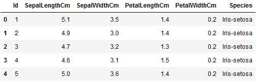
An excellent first step for any exploratory data analysis is to visualize the data structure and plot feature relationships against one another. The code below loads the Iris data set and displays the first five rows as a table.
# Import the dataset
iris = pd.read_csv(
    "https://www.oak-tree.tech/documents/159/iris.csv")

# View the dataset
iris.head()
Reshaping the Data
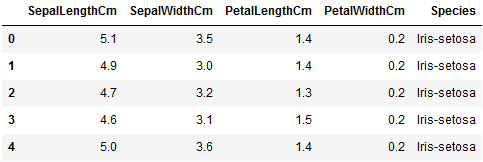
This dataset includes an Id column that provides no information. The code below removes Id and reloads the modified data frame:
# Remove the Id column and reflect the changes into the dataframe
iris.drop('Id', axis=1, inplace=True)

# View the dataset
iris.head()
Dealing With Missing Data
Null values are cells in a data frame that have no value (this is different than values that have a "zero" value). Null values happen when no information is provided. In Pandas null is encoded as "NA" which stands for "not a number."
Missing data is hard because it can represent one of many different situations. Maybe the data was never collected because someone forgot to ask, or maybe a test was conducted and the results got lost, or maybe the result was indeterminate.
Regardless of what caused the missing data, something needs to be done about it. Trying to incorporate the missing values will derail your model, and many machine learning algorithms don't work when null values are present.
We can use the Pandas info() method to provide a summary of the Iris dataset, which allows for us to check for the presence of null values or other inconsistencies; and make decisions about how to act.
iris.info()
The summary output tells us that we have a complete data set, and we can move forward with the analysis of our data.
RangeIndex: 150 entries, 0 to 149
Data columns (total 6 columns):
 #   Column         Non-Null Count  Dtype
---  ------         --------------  -----
 0   Id             150 non-null    int64
 1   SepalLengthCm  150 non-null    float64
 2   SepalWidthCm   150 non-null    float64
 3   PetalLengthCm  150 non-null    float64
 4   PetalWidthCm   150 non-null    float64
 5   Species        150 non-null    object
dtypes: float64(4), int64(1), object(1)
memory usage: 7.2+ KB
Descriptive Statistics
Using the describe() method of the Iris dataframe, we can inspect the summary/descriptive statistics of the data. Understanding the distributions of the columns allows us to get a feel for our variables, and place it within a larger context that will be useful for assessing the models we build.
iris.describe()
The code listing below shows the output of the command above. For each column, we can identify the:
- total count of observations
- mean (average)
- standard deviation
- quartiles: 25%, 50% (median), 75%
- min and max value
It looks like the length and width of the sepals are normally distributed, along with petal length. Petal width looks as though it may be skewed to the left slightly (the mean is slightly lower than the median -- 50% value). Reviewing the summary statistics for each of the quantitative columns is an important step in assessing your data since many machine learning algorithms make assumptions about how the values are distributed and the variables are independent from one another.
Id 	SepalLengthCm 	SepalWidthCm 	PetalLengthCm 	PetalWidthCm
count 	150.000000 	150.000000 	150.000000 	150.000000 	150.000000
mean 	75.500000 	5.843333 	3.054000 	3.758667 	1.198667
std 	43.445368 	0.828066 	0.433594 	1.764420 	0.763161
min 	1.000000 	4.300000 	2.000000 	1.000000 	0.100000
25% 	38.250000 	5.100000 	2.800000 	1.600000 	0.300000
50% 	75.500000 	5.800000 	3.000000 	4.350000 	1.300000
75% 	112.750000 	6.400000 	3.300000 	5.100000 	1.800000
max 	150.000000 	7.900000 	4.400000 	6.900000 	2.500000
Visualize the Data
An important second step in exploring the data comes in the form of visualizing it. In this section, we will use the plot command of Pandas to create scatterplots to explore the relationships between the variables. Under the hood, Pandas leverages Matplotlib to create the visualizations..
The code below shows how to create a scatterplot with multiple groups of data and a set of tweaks. This example shows how the various Scientific Python libraries can be used together. Most plot methods in Pandas, for example, will return a "figure" object from Matplotlib that can be customized. While this example demonstrates how to generate scatterplots, the plot command can be used to create a variety of charts and graphs.
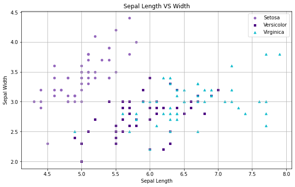
For our scatterplot, we generate a "figure" (fig) by calling the plot method of the Iris data frame. This figure contains methods to update aspects of the plot like the title and axes. In this example, we've chosen to plot each of the different types of Iris in a different color and with a different shaped marker.
This was done by first creating a Pandas statement that filters each of the three species before plotting; and then specifying a color and marker option. To further customize the plot, we use the fig reference to set the labels for the X and Y axis, the title of the graph, add a grid (fig.grid(True)) to make it easier to compare the clusters of points, and to set the size of the output graphic.
Finally, we display the graph by calling plt.show(). Within Jupyter, it's possible to have a separate "figure" for each code cell of a notebook.
# Create the figure from Sepal dimensions in the Iris dataset
fig = iris[iris.Species=='Iris-setosa'].plot(kind='scatter', x='SepalLengthCm',
    y='SepalWidthCm', color='tab:purple', label='Setosa', marker='o')
iris[iris.Species=='Iris-versicolor'].plot(kind='scatter', x='SepalLengthCm',
    y='SepalWidthCm', color='indigo', label='Versicolor', marker='s', ax=fig)
iris[iris.Species=='Iris-virginica'].plot(kind='scatter', x='SepalLengthCm',
    y='SepalWidthCm', color='tab:cyan', label='Virginica', marker='^', ax=fig)

# Define labels and title
fig.set_xlabel("Sepal Length")
fig.set_ylabel("Sepal Width")
fig.set_title("Sepal Length VS Width")
fig.grid(True)

# Formatting
fig=plt.gcf()
fig.set_size_inches(10,6)

# Output the grid
plt.show()
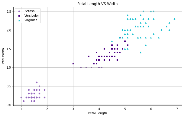
What does the relationship between petal length and width look like?
# Create the figure from Sepal dimensions in the Iris dataset
fig = iris[iris.Species=='Iris-setosa'].plot(kind='scatter', x='PetalLengthCm',
    y='PetalWidthCm', color='tab:purple', label='Setosa', marker='o')
iris[iris.Species=='Iris-versicolor'].plot(kind='scatter', x='PetalLengthCm',
    y='PetalWidthCm', color='indigo', label='Versicolor', marker='s', ax=fig)
iris[iris.Species=='Iris-virginica'].plot(kind='scatter', x='PetalLengthCm',
    y='PetalWidthCm', color='tab:cyan', label='Virginica', marker='^', ax=fig)

# Define labels and title
fig.set_xlabel("Petal Length")
fig.set_ylabel("Petal Width")
fig.set_title("Petal Length VS Width")
fig.grid(True)

# Formatting
fig=plt.gcf()
fig.set_size_inches(10,6)

# Output the grid
plt.show()
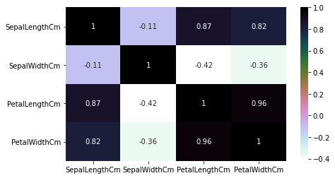
Heatmaps
If there are a large number of features within a data set, we can use a heat map to explore the correlation between all columns in the data set. Seaborn, a visualization library that extends Matplotlib, offers a convenience function to generate the visualization in a single line of code.
Heatmap graphics display each of the variables in a data set as a grid with a color coded score. The color at the intersection of the columns is related to the Pearson correlation value, and allows for a user to quickly locate variables that are strongly correlated with one another.
In the example shown below, black represents a coefficient of 1 (strong positive correlation), purple is 0 (no correlation), and lighter values represent a negative correlation. Along the diagonal, when the features align with themselves, the coefficient is "1". These cells should be ignored.
The heatmap method in Seaborn does not automatically span the values from -1 to 1 unless the values in the matrix do, or unless we add a vmin and vmax parameters.
plt.figure(figsize=(7,4))
sns.heatmap(iris.corr(), annot=True, cmap='cubehelix_r')
plt.show()
Step 1: Splitting the Dataset
Once you've reviewed and cleaned the data, you are ready to create (the first iteration of) your model.
While they may seem magical, classification models are mathematical (statistical) formulas that map the relationships of a set of features onto a label. The algorithms behind them look at how various features contribute to a class and create a series of weights (or rules) that describe the relationships amongst the data. Once created, the same formula can be applied to new information to make predictions about which classes it thinks the new observations belong to.
In this example, the petal and sepal dimensions will be our model's features, and the species will be the label. The process of creating the model is called "training."
Model Generalization
When creating a machine learning model, a common problem is to have it perform very well on one batch of data and very poorly on another. Consider, for example, that you are trying to estimate the cost of homes in San Francisco. You aggregate a large set of data, create a model, and then test the model's behavior and find it predicts the cost of homes with 99% accuracy.
Buoyed by your success, you decide to try the model on a new set of homes the model has never seen before. Unfortunately, your model doesn't do as well with the new data and delivers poor results, perhaps only 25% or 30% accuracy. When this happens, it is said that the model doesn't "generalize" well from training data to unseen data.
There are many reasons why this might happen: the original data set might not be representative of new data (a model trained on home sales data that are out of date, for example, will underestimate the cost of a home), or the choice of algorithm might not be a good fit for the type of problem you are trying to model. Figuring out why the model doesn't generalize well is a large part of the "art" in machine learning.
Regardless of the reason, these types of errors are a significant problem and, if not resolved, can derail your whole project. In the next article in this series, we'll look at ways to assess your model and safeguard against certain types of these errors. In this article's context, however, there is one type of error that we particularly want to safeguard against: getting suckered into believing that a model performs well when it in fact does not because we allowed our model to "memorize the data."
To avoid this pitfall, we suggest you follow a simple rule of thumb: Don't let your model see the same piece of information twice.
Creating Testing and Training Sets
Think of your data as a limited resource: you can use some of it to train the model or use it to evaluate it. Using the same piece of data to both train and evaluate, however, will put you at risk of a particular type of error called "overfitting."
To that end, we will take our data set and split it into two parts: a training set that is used to fit and tune the model, and a testing set that will be set aside as unseen data to evaluate the model.
While there are a variety of tools and approaches that we might use to create these splits and measure the overall variation in the model, we will use a method from one of SKLearn's data preparation libraries, sklearn.cross_validation called train_test_split to randomly sample data into the training and testing groups.
The code below shows how to prepare the Iris data:
- First, we use
train_test_splitto randomly sample cases intotrainandtestdata frames. - Next, we remove the "Species" column from the new data frames and assign that to (yet) another dataframe called
X. In machine learning, X is often used to represent the set of features that will be passed to the model algorithm. This is done twice, once for the training group and a second time for the testing group. - Finally, we assign the target (Species) to a second variable called
y.
# Split the iris dataset into a train and test sets.
train, test = train_test_split(iris, test_size=0.3)

# Assign training data features and targets
X_train = train[['SepalLengthCm', 'SepalWidthCm', 'PetalLengthCm', 'PetalWidthCm']]
y_train = train.Species

# Assign test data features and targets
X_test = test[['SepalLengthCm', 'SepalWidthCm', 'PetalLengthCm', 'PetalWidthCm']]
y_test = test.Species
The parameter test_size=0.3 specifies how we want the data split. Here, we use a 70%/30% split with the training set receiving 70% of the cases and the testing set 30%. Generally speaking, you want the training set to be as large as possible, this will help safeguard against overfitting.
With testing and training groups in hand, we are ready to create our model.
Step 2: Training the Model
While there are many opinions about choosing an appropriate algorithm for a model, often it comes down a simple process of experimentation and trying many different models. This is sometimes called the "No Free Lunch" Theorem. Luckily, SKLearn provides a uniform API that makes this very easy, a large part of why it has become so popular.
To create a model in SciKit-Learn is a three step process:
- Initialize the model instance with desired algorithm parameters
- Fit the model to the training data (
X_train) and target (y_train) - Assess or apply the model
The code listing below shows what this looks like using the "Dummy Classifier." As noted above, the "Dummy" classifier is a stupid algorithm that basically chooses label values randomly.
# Initialize the model algorithm
dc = DummyClassifier(random_state=42) # define the model

# Train/fit the model to the data
dc.fit(X_train, y_train)

# Apply the model to the testing data to get a new set of predictions
# and show the accuracy score
prediction = dc.predict(X_test)
print('Iris Dummy Classifier Accuracy:', metrics.accuracy_score(prediction, y_test))
The listing below shows the output of the code above. As expected, the accuracy of the Dummy Classifier is terrible.
Iris Dummy Classifier Accuracy: 0.3333333333333333
In the next three sections, we'll look at how three other algorithms compare:
- Support Vector Machines (SVM)
- Decision Trees
- K-Nearest Neighbors (KNN)
SVM
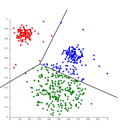
The Support Vector Machines (SVM) algorithm produces a hyperplane that separates the data into classes. This algorithm works by (basically) transforming the data to a scatter-plot in a multi-dimensional space that is defined by the number of features you have. These features have values that relate to the data points. Then classification is done by finding some type of dividing line (or the multi-dimensional equivalent, the hyperplane) that best distinguishes amongst the classes.
model = svm.SVC()
model.fit(X_train, y_train)
prediction = model.predict(X_test)
print('SVM Iris accuracy:', metrics.accuracy_score(prediction, y_test))
Output:
SVM Iris accuracy: 0.9111111111111111
Decision Trees
Decision Trees create a branching system that looks at how the variables contribute to the outcome. It then ranks the contribution and builds a set of "questions" that can help structure an assessment for new information.
For example, if assessing whether a person is fit, the decision tree might break down variables such as age, whether or not they exercise, and diet (do they consume a large amount of pizza, for example). The algorithm will then create breakpoints and logical rules and encode those into the model instance.
model=DecisionTreeClassifier()
model.fit(X_train, y_train)
prediction = model.predict(X_test)
print('Decision Tree Iris accuracy:', metrics.accuracy_score(prediction, y_test))
Output:
Decision Tree Iris accuracy: 0.9111111111111111
K-nearest Neighbors
K-Nearest Neighbor uses a set of nearby points to predict outcome targets. This is done by accumulating the minimum distance from the neighboring data points and taking an average or consensus. This aggregation of close data-points determines the nearest neighbors. After processing all the nearest neighbors, the majority is selected to be the prediction of the data points.
model = KNeighborsClassifier(n_neighbors=5)
model.fit(X_train, y_train)
prediction = model.predict(X_test)
print('KNN Iris accuracy:', metrics.accuracy_score(prediction, y_test))
Output:
KNN Iris accuracy: 0.9555555555555556
Conclusion
And there you go, you now have a trained model instance. While there are nuances, the workflow we have seen in this article:
- prepare and explore the data: shape and tune, deal with missing values, validate model assumptions, and explore/visualize
- create training and testing splits
- generate and assess model algorithms for their general accuracy
are the fundamental process that every data scientist undergoes to create a classification model. This is only the beginning, however. Beside model accuracy, we haven't yet started tried to answer the question: Is my model any good? That's what we'll get into in Part 2.
Comments
Loading
No results found